 Brand guidelines
Updated Sep 2026
Brand guidelines
Updated Sep 2026

Brand
guidelines
How AlterContacts looks, sounds and behaves, and why.
In brief
For advisors whose books outgrew their memory, Alter remembers everything, spots who needs you today, and drafts the move.
A personal AI assistant for people whose business runs on relationships. It captures by voice, works out what is worth pushing forward, and readies it for you. You review, you send, you stay the advisor.
Financial advisors in Singapore are the first cohort. The brand is built for anyone who eats off relationships, so the category language stays wide.
Inspiration
People have always talked things through and scribbled them down. That is how a relationship gets remembered, and it works right up until the book outgrows the notebook. Then the note is still there and nothing acts on it.
That gap is the product. Alter keeps the talking and the scribbling, and adds the part a notebook never had: an assistant that reads what you captured, notices what matters, and readies the next move for you.
The brand shows both halves. Hand-drawn carries the warmth of the human way of remembering. The clean, fast interface carries the assistant. Warm on its own is slow, clean on its own is cold, so every surface needs both.
Design principles
How things get made, before any specific rule applies. Four decisions a designer takes on every surface so that it feels like an assistant standing behind you: quiet, warm, and real.
Minimal by default,
warm by exception
The clean interface does the work. Hand-drawn things are sprinkled in, never spread: marker, chalk, a crab peeking from a corner. One warm moment per surface is usually enough, and two is decoration. Start minimal and add the hand back deliberately rather than starting warm and tidying up.
Let negative space
do the detail
Detail comes from taking fill away, never from adding marks on top. The eyes are punched clean through the shell and the background shows straight through them. No outlines, no shadows, no glows, no gradients, nothing behind or beneath a shape. The colour is the drawing.
One idea per surface
Give the one thing the whole frame. A stat, a claim, or an image, never all three competing at equal weight. A layout saying three things is saying none, and an equal-weight feature grid is the specific shape that failure takes here. If everything on the surface is the same size, nothing has been decided yet.
Put it in a real room
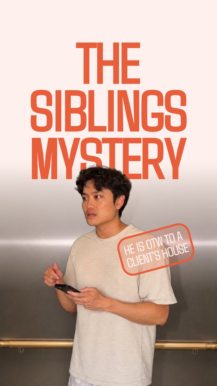
Warm light, actual rooms, cars and corridors, a phone in a hand. Interface floats into live action rather than sitting on a device mockup on a gradient. Never a studio white-out, never a stock desk. If the setting could belong to any software company, it is the wrong setting.
Shipped
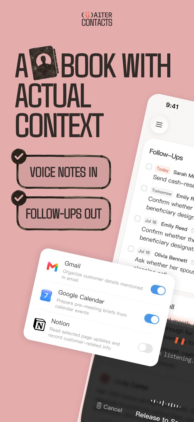
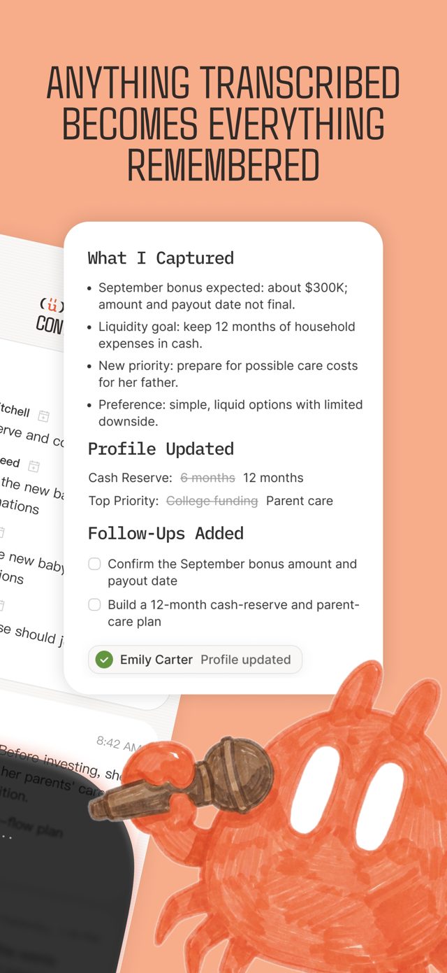
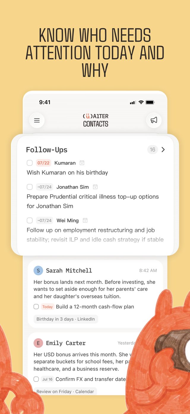
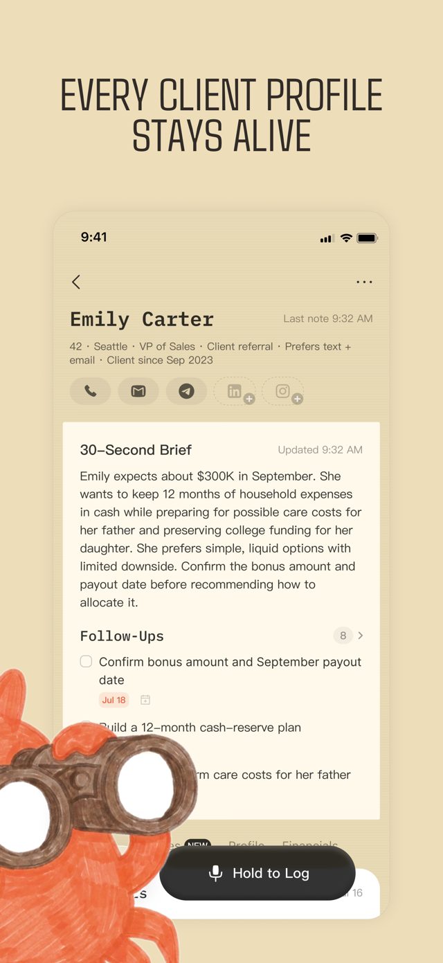
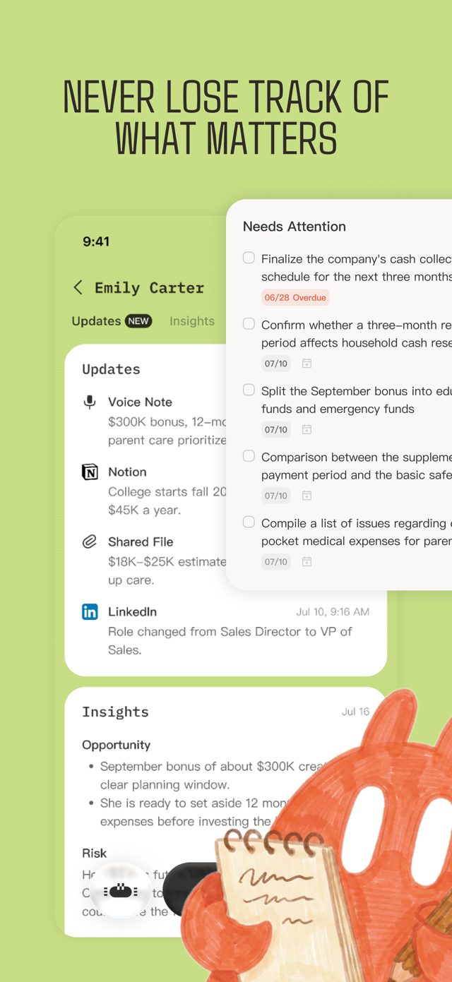
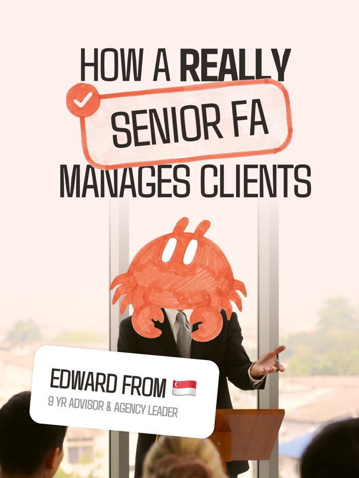
The App Store set, as it stands today. It is the best single reference for the whole system: chalk-marker props, one secondary ground per slide, real interface floating in the frame, Alter at the edge with something in her claws, and the assistant's own work in every card.
Logo
What you'll find
- The (ü)
- The lockup
- Anatomy
- Which one to use
- Avatars
One symbol and one lockup, and they are peers. The symbol is Alter's face: two eyes over a smile, small enough to sit anywhere the assistant does. The lockup is the same face with the name attached, for people who have not met us yet.
The (ü)
Two eyes and a smile, held in a pair of parentheses. Said aloud it is you. It is the face of the assistant, which is why it is the mark we reach for most and the icon on the phone.
Primary mark and App Store icon. Use it in about 60% of applications.
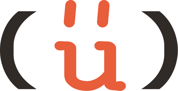
The (ü) keeps a clear margin of one umlaut dot on every side, which is 30% of its height. It appears only in these three colourways: primary on white or peach, knockout on ink, white on orange.
The lockup
The face stacked over the name, in its own letterforms. For the moment someone has to learn who Alter is.
About 40% of applications. Never narrower than 120px.
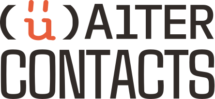
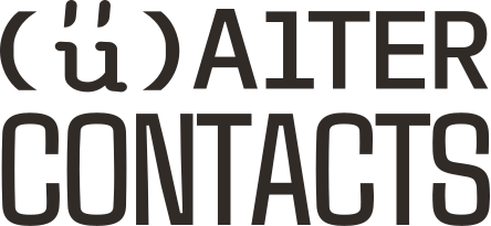
The lockup keeps a clear margin of one u, the letter inside its parentheses, on every side, which is 22% of its height. It appears only in these three colourways: primary, white on ink, and mono ink. It never sits on orange.
Anatomy
Every part of the lockup is doing a job. Four of them, and each one is a decision we would make again.
In copy the name is always written AlterContacts. The drawing is a drawing.
1
2
3
4
- 1
The (ü) is "you"
Say the umlaut aloud and the name reads Your Alter. The parentheses are what make it yours. It is smiling on purpose: this is an assistant that stands behind you, and it is glad to be there.
- 2
Alter, the verb and the ego
To alter: it changes how you keep clients, by remembering so you don't have to. Alter ego: the version of you that never lets a good client go quiet. It carries your voice and your judgement, and it works in the background.
- 3
The L is an AI
AITER still reads as "alter". The AI sits inside the name instead of being bolted on as "AI-powered". It is the part quietly doing the remembering. Never correct it back to an L.
- 4
Contacts, at full width
The dullest app on the phone, said plainly and set to the full width of the mark. Your contacts are your business, and that list has been sitting there dead. We took the boring word and made it the point.
Which one
One question settles it: does the person looking already know who we are? The symbol is not a fallback for when the lockup will not fit. They are peers, the way a familiar app is a symbol on a home screen and a name on a billboard.
They know us
The (ü)
- App Store icon, favicon, profile pictures
- Anywhere the name is already on the screen
- Square or circular crops
- Anything narrower than 120px
- Stickers, merch, one-shape print
They might not
The lockup
- First impressions: decks, site header, ad end cards
- Partner rows and sponsor walls
- Print where the name has to be learnt
- Video lower-thirds and title cards
Avatars
Profile pictures are circles, and the lockup will not survive one. The (ü) sits in the circle the way it sits in the icon: 72% of the width, centred.
Three avatars, matching the three grounds. Never the lockup, never the crab.
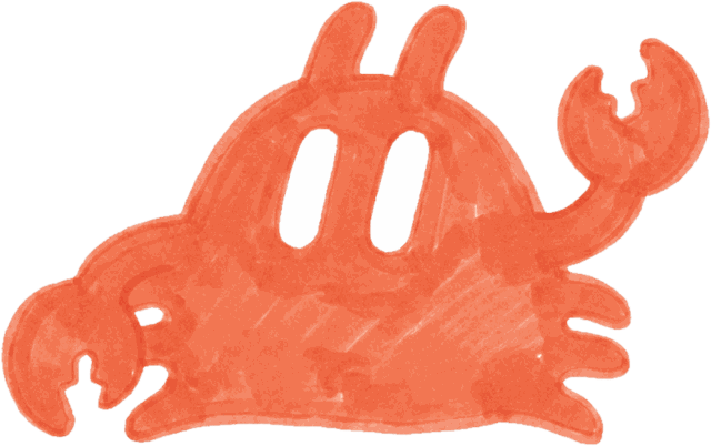
The crab has its own place in the product as the agent button. On a public profile the face people should learn is the (ü).
Mascot
What you'll find
- Meet Alter
- Two renderings, idle and thinking
- Anatomy
- Poses
- Placing her
- Do and don't
- Where she appears
Alter is the assistant, and the crab is what the assistant looks like when it needs a body. She is the character a user hands things to inside the product: the agent, never the company. A mascot, never the logo.
Meet Alter
The alter ego made visible: the version of you that remembers, notices what is worth pushing forward, and readies it. Drawn in marker because that is the human half of the brand; she is the warmth on an otherwise clean screen.
She works behind you, so she lives at the edge of the frame. Seasoning, never the meal.
White, peach and ink. Her eyes are white in every file, so she holds on all three. She never sits on orange, where she disappears.
Two renderings
Alter is drawn twice, and the two are the two halves of the brand. The marker form is the human half: it carries the warmth outside the product and in its quiet moments. The pixel form is the machine half: the same body reduced to what holds at 24 pixels.
Marker everywhere she is a character. Pixel wherever she is interface.
Marker form · empty states, onboarding, social, print, cornersThe pixel form is one solid orange rounded body, the two eyes as notches punched from the top edge, and three detached bars a side for legs. No texture, no antennae, no claws: at button size they would be noise. The eyes are what make it still her. At rest she idles: the eyes blink and shift, nothing else moves.
Thinking
While the agent works, the pixel form is busy. Four tiny scenes, each eight frames, all shown at 80 pixels tall, which is their working size. They are pixel art: crisp small, broken when enlarged.
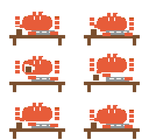 On the bench
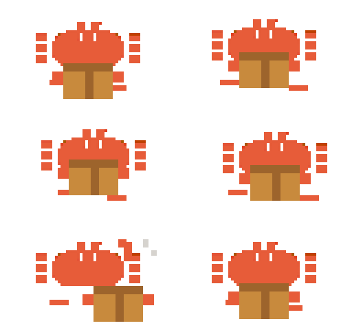 In the box
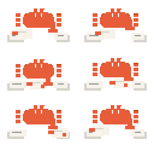 With the papers
 Tiny
TinyNever scale these past 80 pixels. The idle loop is the one to reach for wherever there is room.
Anatomy
Five things never change, whatever she is doing. Every new pose is checked against them before it is approved, and every one of them is visible in this drawing.
If one of the five is off, it is not Alter. It is a crab.
1
2
3
4
5
- 1
One dome
A single soft loaf, wider than it is tall. No neck, no head, no mouth, no eyebrows. The dome can tilt, lean or turn, and it stays one shape.
- 2
Two eyes, always the umlaut
Two tall white capsules, side by side. The same two marks as the (ü). They slide across the dome to show where she looks and squash or stretch to show how she feels. Never dots, never slits.
- 3
Two nubs
Short, stubby, rounded antennae on top. They perk up or droop with the mood, and they never grow long or thin.
- 4
Two pincers, one notch each
Chunky mitten claws, one a side, with a single bite out of the tip. Blobby and soft. They hold props and wave; they never point at the viewer.
- 5
Four legs
Two short flame-shaped legs on each side, tucked low. Never more, never jointed. More legs is the fastest way to lose her.
The style
Marker texture in
Real alcohol marker on paper: directional streaks, darker bands where strokes overlap, thin lighter patches where the ink runs dry. A flat digital fill is the first thing that gives a fake away.
Nothing behind her
No shadow, no disc, no halo, no glow, no outline. She sits flat on the ground she is given, and the colour is the drawing.
Eyes white, always
Two white capsules, nothing inside them. In the files they are solid white so she holds on any ground; on the drawing they read as empty.
Edges organic
Nothing is a perfect circle or a straight line. Claws are blobby, legs taper, antennae wobble. Confident but imperfect is what keeps her friendly.
Poses
Twenty-five approved poses in three families. Props for product moments, movement for corners and edges, feeling for the moments the assistant has something to say.
Use these files. New poses are generated against them and approved by Jonas before they join.
With props · product moments
Waving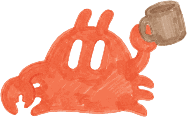 Coffee
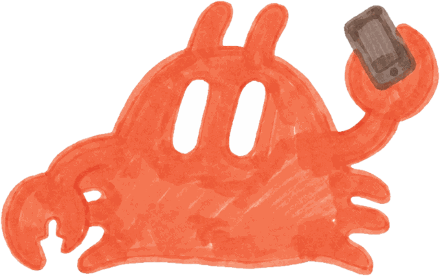 Phone
Phone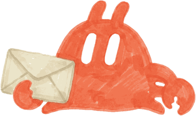 Envelope
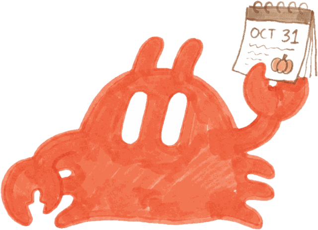 Calendar
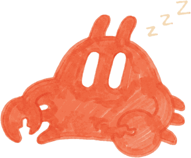 Dozing
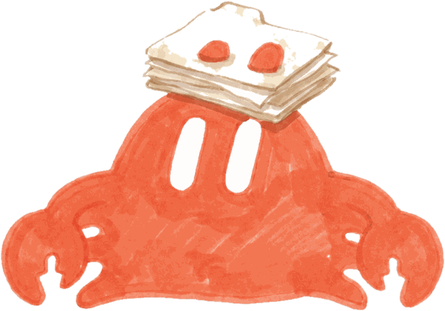 Folders
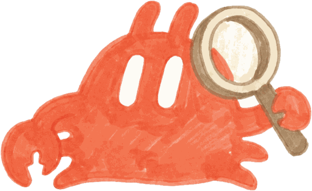 Magnifier
 Gift
Gift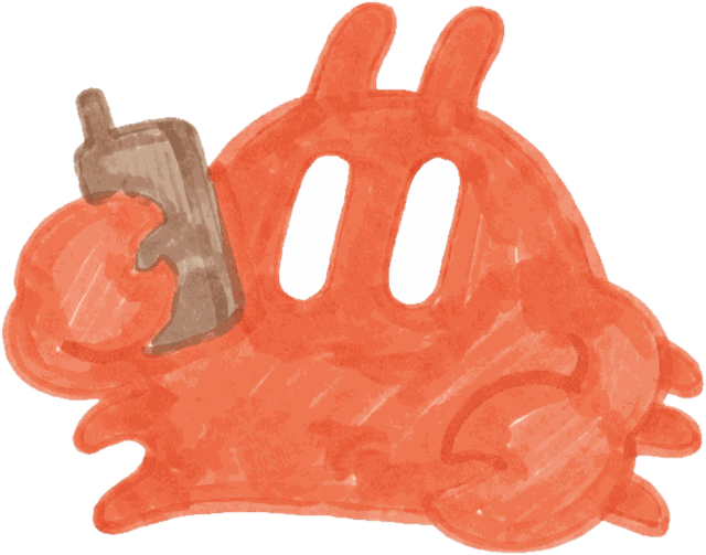 Phone, alt
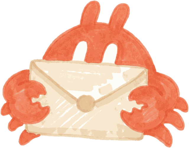 Envelope, alt
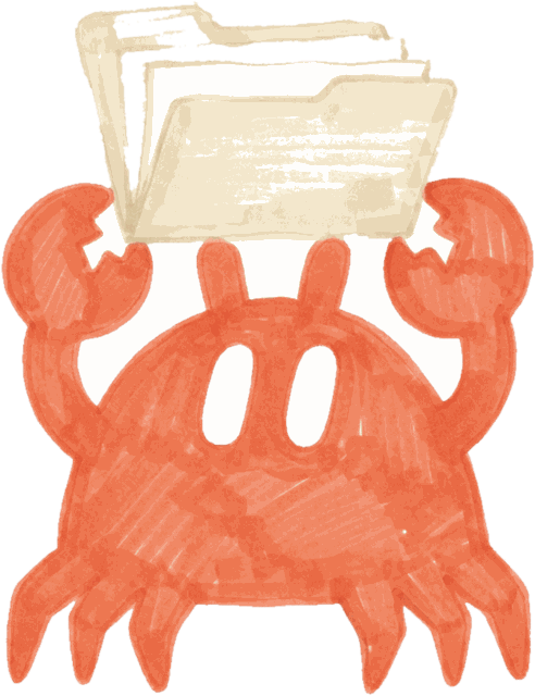 Folders, alt
Moving · corners and edges
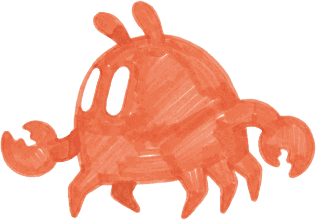 Glancing back
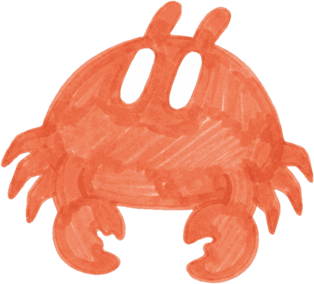 Looking up
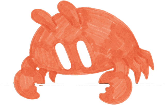 Peering down
Feeling · when the assistant speaks
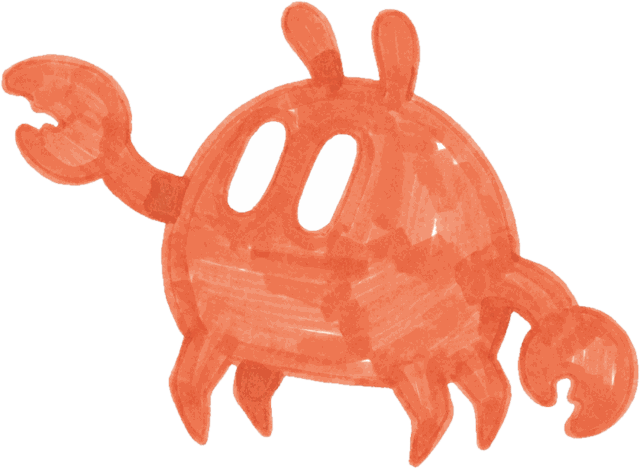 Curious
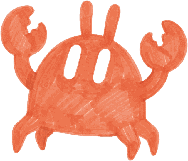 Surprised
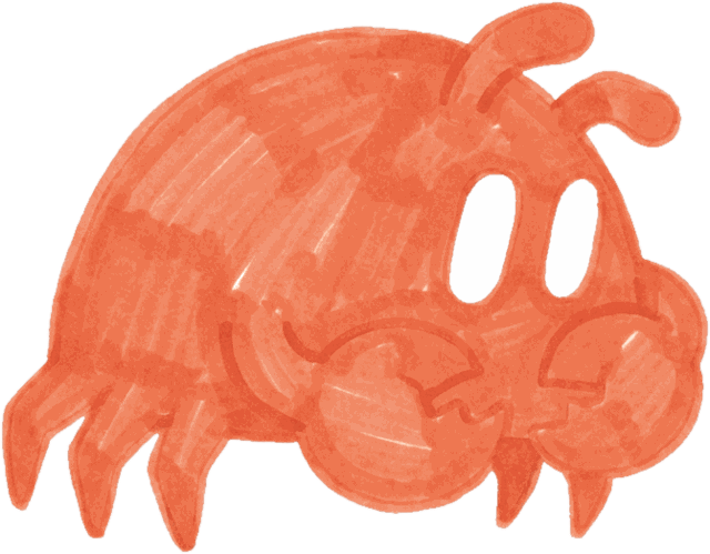 Shy
Shy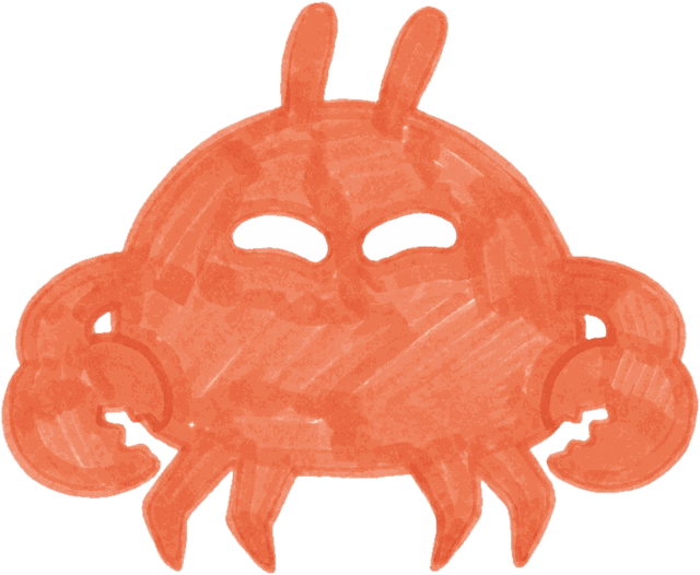 Pleased
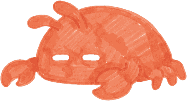 Content
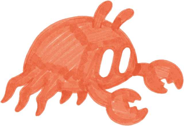 Eager
Eager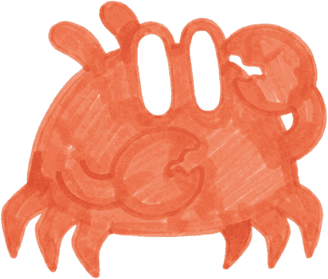 Oops
Oops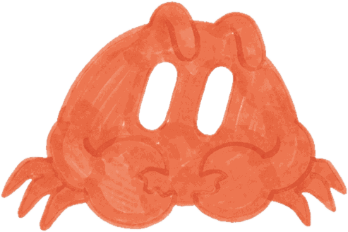 Worried
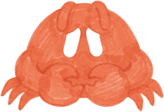 Worried, ii
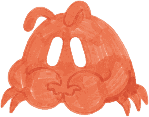 Worried, iii
Props stay in the muted palette: warm brown, cream, charcoal. They are held to the side at shell height so the face is always clear. Feeling is carried by the eye pair and the posture, never by a mouth or a symbol.
Placing her
Alter sits at an edge and is usually cropped by it. Around 15 to 20% of the canvas is the norm; she can be bigger, as long as what matters on the surface stays visible.
One warm moment per surface. A second Alter is decoration.
Covering the content
Do's
Keep her at an edge, cropped by the frame. Around 15 to 20% of the canvas is the norm.
One Alter per surface, and only when the screen has nothing to show yet or something to say.
Take the file from the approved folder and place it as it is.
Put her on white, peach or ink. Her eyes are white, so she holds on all three.
Quiet verbs: peeking, glancing, holding, waiting. She works behind you.
Marker form where she is a character. Pixel form where she is interface.
Don'ts
Never cover the content. Big is fine at an edge; over the words it is not.
Never two of her on one surface, and never as the hero of it.
Never recoloured, tinted, stretched, or redrawn from memory.
Nothing behind or beneath her: no shadow, no disc, no glow, no outline.
Never pointing at the viewer, shouting, or jumping in from the middle.
Never where the logo goes: app icon, favicon, avatars, the top of a deck.
Where she appears
Inside the product she shows up when the assistant has nothing to show yet or something to say. Outside it she is the warm touch on an otherwise clean composition.
If the screen is doing its job, she is not needed on it.
Empty states
Nothing here yet
A prop pose that names the missing thing: folders for an empty client list, envelope before email is connected, calendar before the first follow-up.
Loading and waiting
Give it a second
Dozing or content. Small, in a corner, still.
Onboarding
Hello, from the edge
Waving on the first screen, then gone. She introduces herself once.
Something found
The assistant noticed
Magnifier, curious or eager beside the thing it found. The card is the hero; she points nowhere.
Something went wrong
Oops, and worried
Oops for a slip on our side, worried for a task going stale. Never for the user's mistake.
App Store, social, decks
The corner moment
One pose per slide or cover, cropped by the edge, with a prop that matches the headline.
The agent button and the chat avatar use the pixel form. When Alter speaks, she speaks in her own voice: see Copy.
Colour
What you'll find
- Primary colours
- Secondary colours
- Colour palette
- Colour distribution
Warm neutrals for the room, ink for the words, orange for the assistant. One signature colour, three grounds it lives on, and a set of soft secondaries that give a series its variety without ever competing with the orange.
Primary colours
Our signature colour is orange. It is Alter: the eyes in the mark, the crab's whole body, and the one thing on a screen the assistant is pointing you at. Spend it there and keep everything around it quiet.
The only four colours that ever touch a mark.
As the eyes
On white and ink, where the surface is mostly type, orange marks the one thing that matters: the eyes of the mark, a due date, the name at the top of the morning.
As Alter
Her whole body is orange, which is why nothing else on that surface should be. When she is in the frame, she is the accent.
Secondary colours
Eight soft grounds that sit behind supporting work: App Store slides, social covers, decks. They give a set variety and never appear on a mark.
Primary colours go anywhere. Secondaries go only on secondary surfaces, one per surface.
Colour palette
The palette is rounded out by tints for interface work: chips, hover states, soft grounds behind a card. Each colour at full strength, then at 40, 24 and 8 percent over white.
Tints are for interface. A mark or Alter is never tinted.
First column: the neutrals the product runs on. Ink for type, Muted for secondary text and captions, Rule for hairlines, Peach for the warm ground. On a phone the table scrolls sideways.
Colour distribution
Primary colours carry the brand when it takes centre stage: the product, the marks, the words. Most of any surface is ground, because the assistant stays in the background until it has something for you. Orange is a small, deliberate amount.
Secondary colours signal a series: one per slide, one per cover, changing between surfaces and never inside one.
If orange is more than a tenth of the frame, the assistant is shouting.
Ground about 70, ink about 20, orange about 10. The second row is the App Store set: Rose, Apricot, Butter, Sand, Lime, one ground per slide.
Typography
What you'll find
- Brand font
- Functional pair
- Hand-drawn
Our type runs from loud brand lettering used in marketing to a functional pair used in the product. Together they are the hand and the machine: the chalk and the marker on one side, the clean screen on the other.
Agdasima
Our brand font. Narrow, chalk-like, and always in capitals. Bold carries headlines, App Store screenshot lines, video titles and section titles like the ones on this page. Regular is for the quieter lines beside them: subheads, dates, a second thought under a headline.
Marketing only, never inside the product. Always caps, including quotations.
Note: free on Google Fonts. In Slides or email, where it cannot load, use Oswald.
AaBbCcDdEeFfGgHhIiJjKkLlMmNnOoPpQqRrSsTtUuVvWwXxYyZz
0123456789 ([{}]) !?:;,.-–— &%$#@ +−×= "‘’“”
AaBbCcDdEeFfGgHhIiJjKkLlMmNnOoPpQqRrSsTtUuVvWwXxYyZz
0123456789 ([{}]) !?:;,.-–— &%$#@ +−×= "‘’“”
SF Pro and IBM Plex Mono
Our functional pair, and they only ever appear together. SF Pro is everything in the product that has to be read: body copy, buttons, lists, settings, notifications. It is the system font on iPhone, so the app reads as native and never as branded. IBM Plex Mono sets the headers that name a thing beside it: a client's name, Follow-Ups, What I Captured, the 30-second brief. In marketing, Mono also sets labels, captions, figures and file names, in caps with letter-spacing.
SF for reading, Mono for naming. Neither is ever a marketing headline.
Note: SF Pro ships with iOS and macOS; where it is unavailable, on the web, in Slides or on Android, use IBM Plex Sans. IBM Plex Mono is free on Google Fonts; fallback is SF Mono, then Menlo.
AaBbCcDdEeFfGgHhIiJjKkLlMmNnOoPpQqRrSsTtUuVvWwXxYyZz
0123456789 ([{}]) !?:;,.-–— &%$#@ +−×= "‘’“”
AaBbCcDdEeFfGgHhIiJjKkLlMmNnOoPpQqRrSsTtUuVvWwXxYyZz
0123456789 ([{}]) !?:;,.-–— &%$#@ +−×= "‘’“”
Hand-drawn
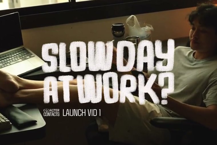
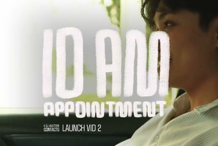
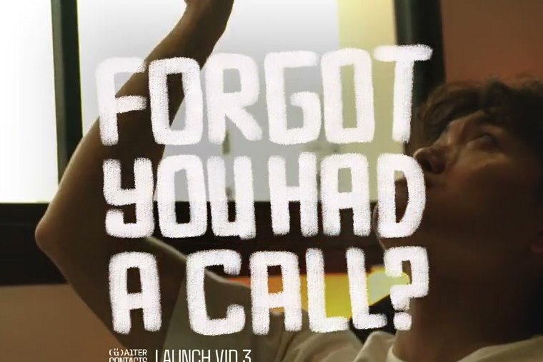
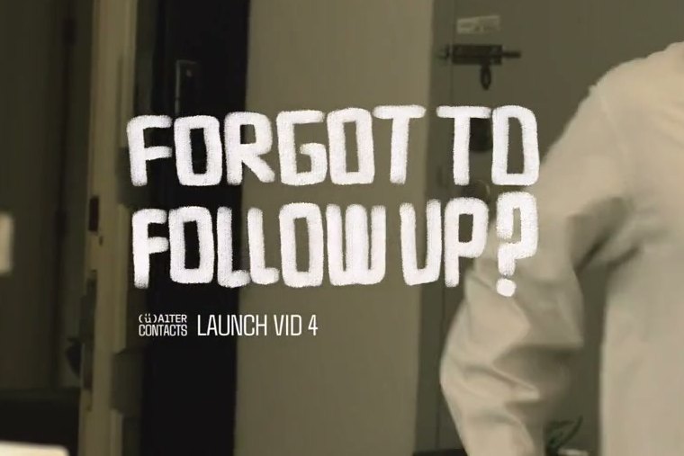
Where Agdasima comes from. Chalk lettering thrown across a real room, drawn by hand for each piece, never a font. It is the warm human half at its loudest: the hook on an ad, a title over live action, a word scribbled next to the marker crab.
Whenever the hand is welcome. One line, in caps, and it moves.
Photography
What you'll find
- Inspiration
- Lifestyle photography
- App demos
Our photography puts the product in a real life. Two kinds, kept apart: lifestyle shoots, where the assistant floats into someone's actual day, and app demos, where the interface is the only thing in the frame. The first carries the warmth, the second carries the clarity, and a surface uses one of them.
Inspiration
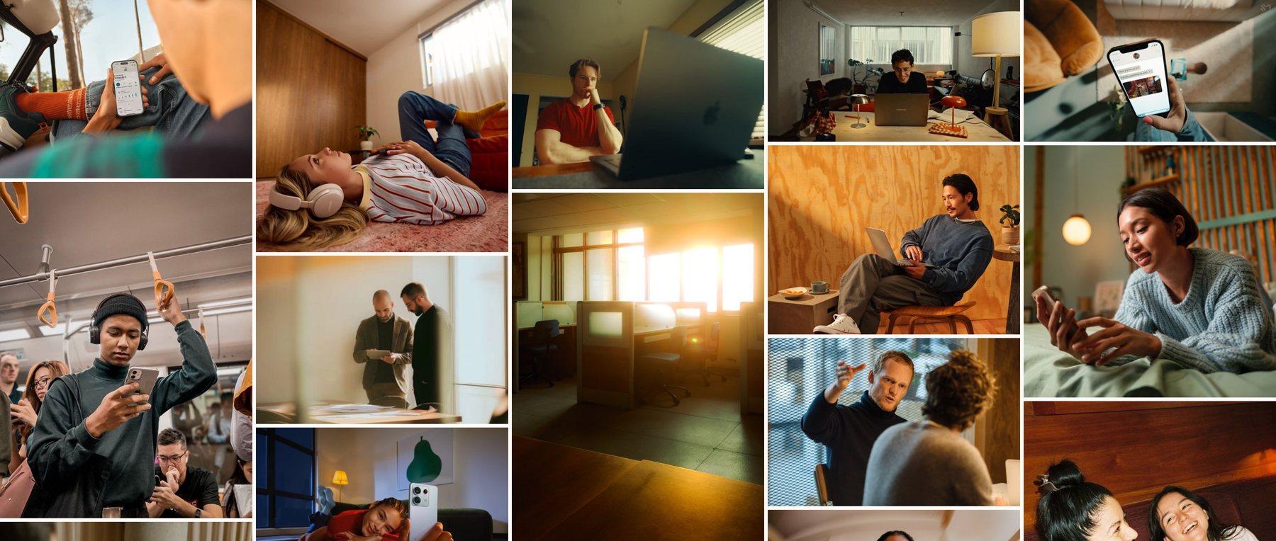
The references we shoot towards. Warm light, real Singapore rooms, cars and corridors, hands and phones, the small mess of a working day.
Lifestyle photography
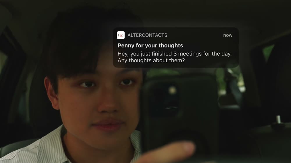
Put the assistant in a real room.
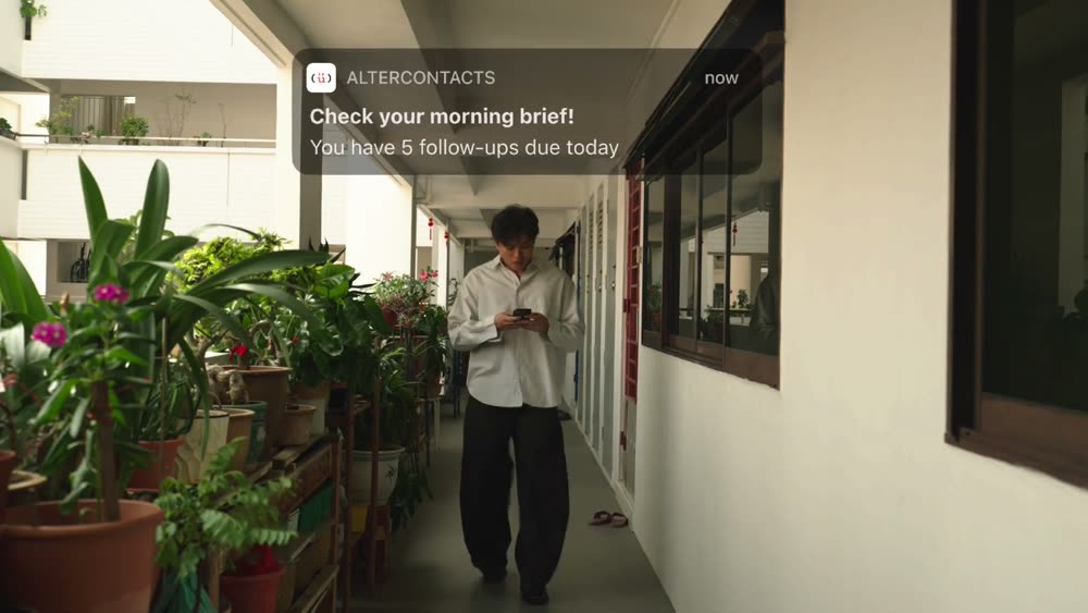
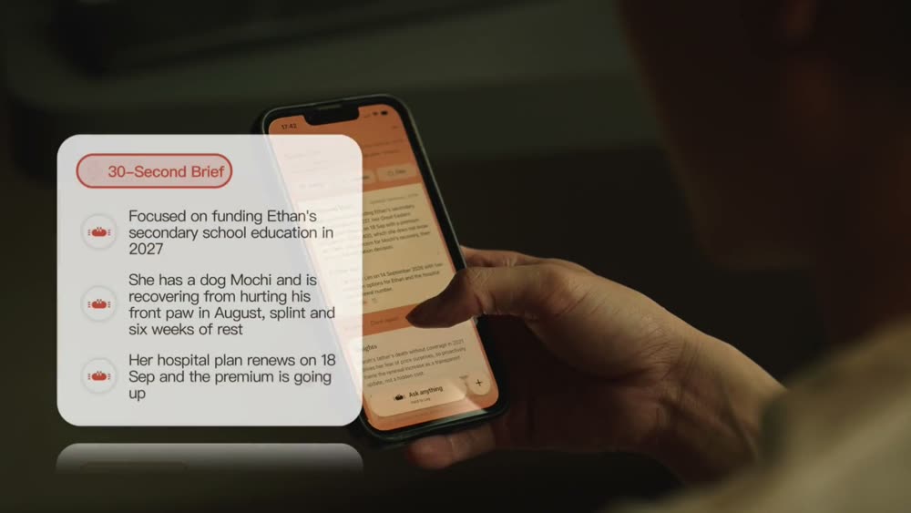
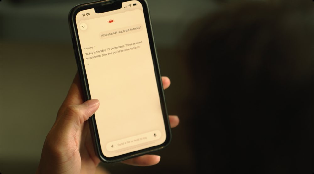
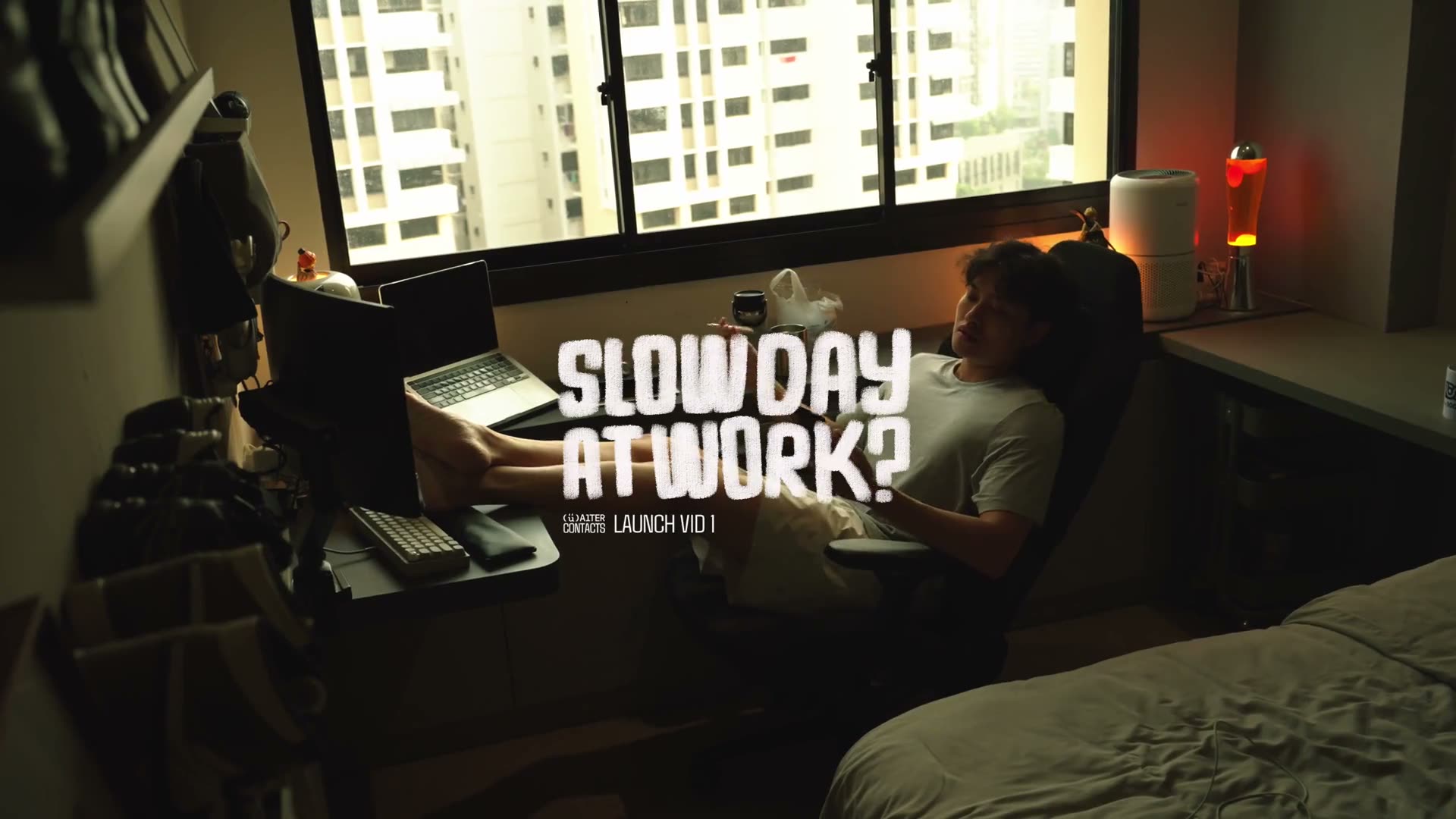
Lifestyle shots are of real people in real places: an advisor in the car before a meeting, on the corridor between appointments, at the kitchen counter in the morning. Warm, natural light. The interface floats into the frame as a card or a notification, and it is the only thing that is not quite real.
Never a studio white-out, never a stock desk, never a device mockup on a gradient. If the setting could belong to any software company, it is the wrong setting.
App demos
Make the app the only subject.
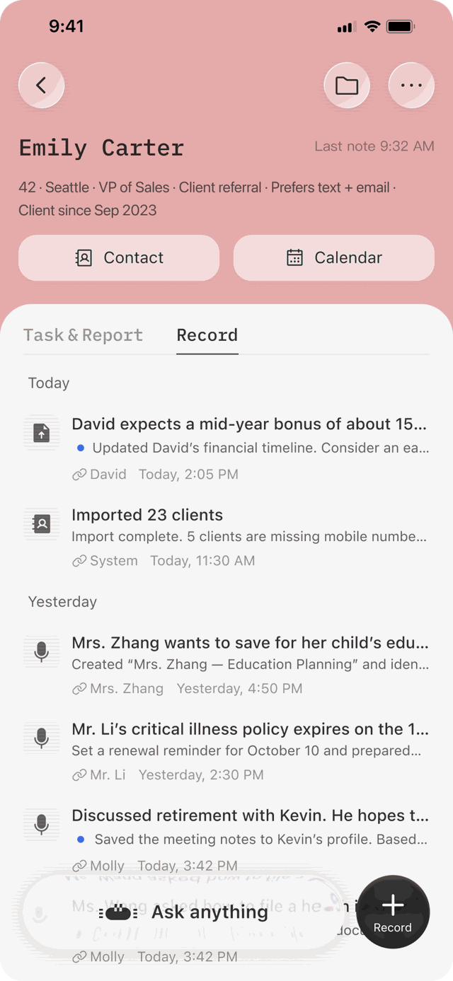
App demos show the product with nobody in the frame: no people, no hands, no phone. The interface is lifted out of the device and enlarged: one card, one recording pill, one of Alter's notes, floating on a soft white ground at a slight tilt. A recording moment may wash the ground orange. One plain headline in a clean sans says what is happening.
They are clean and minimal on purpose. This is the machine half of the brand, and it is where a feature is shown exactly as it works. The content is seeded, never a real client.
Iconography
What you'll find
- Icon library
Our icons are outlined, never filled. They are drawn on the same 24-pixel grid and with the same rounded stroke as the functional type they sit beside, so a line of interface reads as one hand from word to icon. They are ink, and only ink. Orange is Alter's, and the one time an icon takes it is when it stands for her.
Icon library
The working set. Outlined, 1.5-pixel stroke, rounded caps and joins, optically centred in a 24-pixel box. Most come from one family; a few from a second, chosen where the first had no fit, and redrawn to the same weight where they differ.
Outline only. No filled variants, no duotone, no two weights on one screen.
Copy
What you'll find
- Goals and principles
- Voice and tone
- Grammar rules
From a push notification to a launch video, and from an advisor in Singapore to an investor deck, our audiences vary, and so does how we write. What stays the same is who is speaking: a cheerful assistant that noticed something, asked what it needed to know, and got the next move ready for you. And the person who built it. Every line on every surface is one of those two.
Goals and principles
When writing on behalf of AlterContacts, every piece of communication should reflect the strategy: an assistant that takes the initiative to keep client work moving. It sells follow-through, never a list of features. The differentiated sentence is it noticed, it asked, it got the next move ready, never it took notes.
Copy principles
With every notification, empty state, caption, email or deck slide we write, we should aim to:
Lead with the move,
not the mechanism
Say what the assistant did for you: the name at the top of the morning, the question it asked, the draft waiting. How it did it, cards, profiles, transcripts, comes second, and often not at all.
A sentence that opens on a feature is selling a feature. If it could sit on any AI product's site, it is not ours.
Only what it
does today
Bounded claims. Say never lose track of; never say never miss or never forget. Nobody can promise that, and advisors know it.
If it is not shipped, it does not go on a surface, however good the line. Early access means early access; the App Store listing is acknowledged, never pushed.
Wear compliance
as a virtue
You review. You send. Said plainly and early, never as fine print. Privacy comes before capability in every pitch, because that is the order the advisor needs it in.
Privacy is stated as behaviour: reviewed by you, never contacts clients, deleted on request. Never as a certificate we do not hold.
Writing about..
Some guidelines on how we talk about ourselves, the agent, and the people we serve.
AlterContacts
One word, normally spelled, capital A and capital C, in every sentence. The lockup's letterforms are a drawing; never retype them into copy.
The one place the space is right is beside the app icon: the store name and push notifications say Alter Contacts, because the store does.
What it is: a personal AI assistant that keeps track of your clients and keeps the work moving. Voice-first, in your pocket. Never a CRM, never an AI notetaker, never "AI-powered" anything.
Alter
The agent's name, and the crab's. "Send it to Alter." "Alter caught that." She is the alter ego: the version of you that remembers, notices what is worth pushing forward, and asks you what she needs to move it.
When she speaks she is first person, lowercase, cheerful and warm. Pleased to see you, on your side, a little sassy, with the sass aimed at the situation and never at the advisor.
Never a company, never a parent brand, never a synonym for the app. She pushes you, never the client: she asks, reminds, drafts and readies. She never sends.
Advisors and clients
Advisors are named by first name where the surface already names them. On Instagram they are anonymous, with one blurred descriptor: "a Singapore FA, nine years in". Never tenure plus channel plus role; that identifies a person to their own downline.
Clients are seeded demo clients only, on every surface. Never a real client, a real book, or a real screen.
Voice and tone
"The AlterContacts"
A cheerful, friendly peer who happens to remember everything. Glad to see you, easy to have around, honest about what it does, and precise when it matters. Every sentence has the same shape underneath: it noticed, it asked, it readied, you decide.
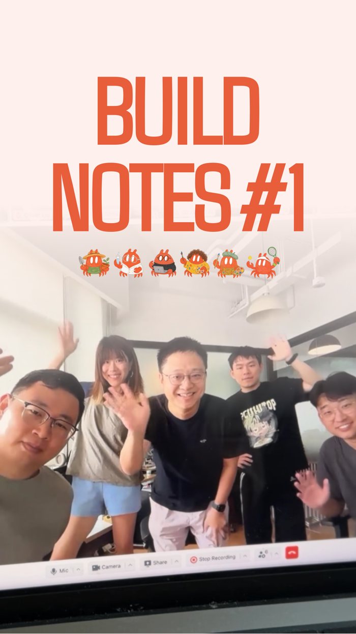
Two people speak for the brand and never in one piece. Jonas hosts, in builder voice: "i built", "i sat with", "i got this wrong". Alter narrates, in hers. A post, an email or a video uses one of them.
Cheerful, not loud
We are glad to be there, and we say so the way a friend would.
Warmth is a good morning, a small joke, a line that sounds like a person. Hype is capitals, emoji and promises nobody can keep. The category does the second and calls it energy; we do the first. One exclamation mark where a person would use one is fine. Three is a sales deck.
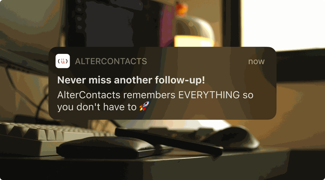
The cheer is fake: capitals, a rocket, and a promise nobody can keep. It sounds like every other app on the phone.
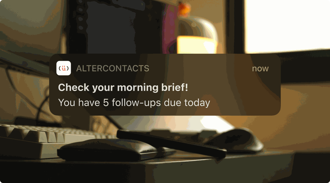
Friendly and plain: a good-morning nudge that says what is waiting and leaves the deciding to the advisor.
Concrete
Real durations, real moments, a thing you can picture.
We write in workflow words: a voice note on the walk to the car, the name at the top of the morning, a birthday in three days. Abstractions are what the category hides behind. If a line could sit on any AI product's site, it is not ours.
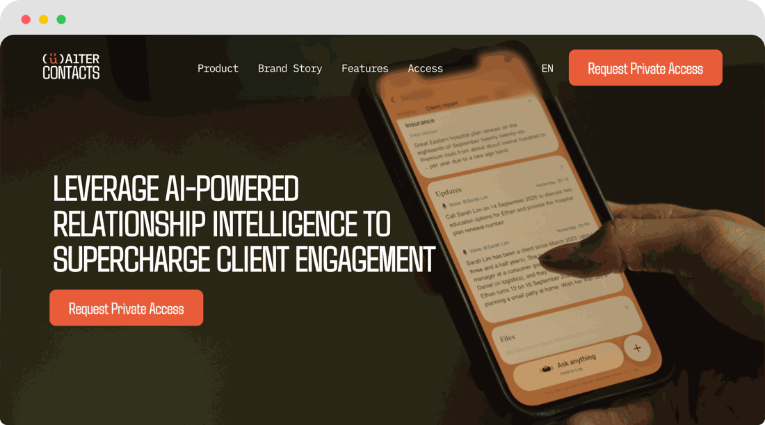
Four abstractions in a row. Nothing here can be pictured, so nothing here is believed.
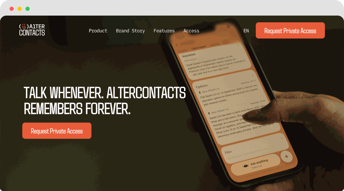
Four words each side. One thing you can picture yourself doing, one thing it does for you. The line the product ships with.
Takes initiative
The assistant does not wait to be asked. It asks.
When a task is stuck on something only the advisor knows, Alter asks the question that unsticks it: a date, a preference, a yes or no. She brings the next move with the question, so answering is the work. Copy that has her waiting for instructions is describing a notetaker, not an assistant.
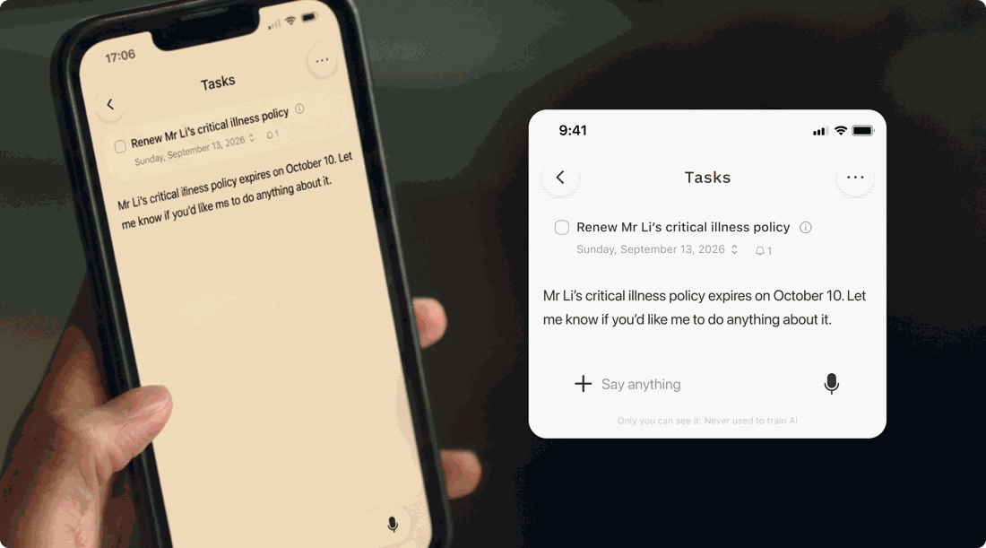
She reports the date and waits. The task is exactly where it was, and the advisor still has to think of the move.
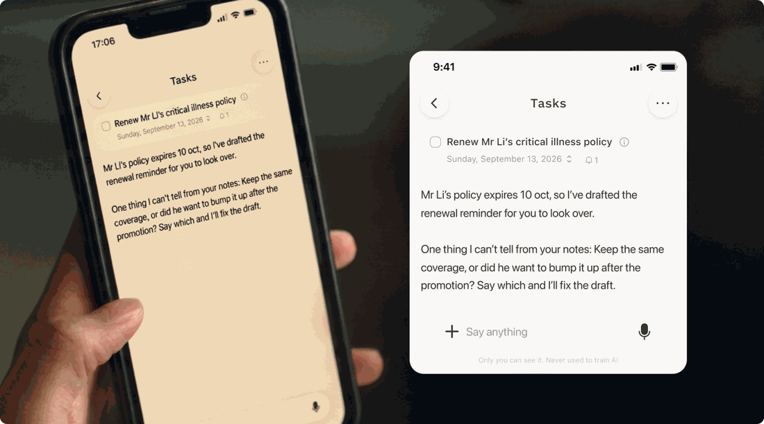
She noticed the date, did the part she could, and asked the one thing only the advisor knows. Answering is the whole job.
Human-reviewed
The agent pushes the advisor, never the client.
Any sentence where the product is the one who contacts someone is wrong. Alter asks, drafts, surfaces and readies; the advisor has the last word and presses send. That gate is the brand, so it is said early, said plainly, and said like something to be proud of.
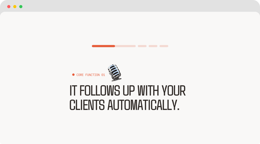
The product is contacting clients. It never does, and an advisor who believes it did will never trust it.
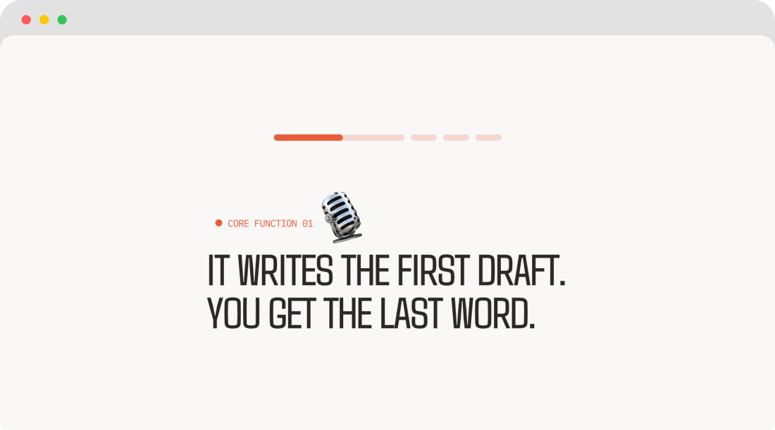
Eight words, and the gate is in them: she drafts, you decide. Warm, and true to what ships.
Grammar rules
Some ways in which we write. Following these keeps the many surfaces reading as one hand, from a button label to a founder email.
Do's
Sound glad to be there. A good morning, a small joke, a line a person would say out loud. Sentence case everywhere but Agdasima headlines.
Write AlterContacts as one word, normally spelled. Alter Contacts with a space only beside the app icon and in push copy.
Hyphens, commas and full stops. Short sentences that state the thing directly.
Bounded claims: never lose track of, keep track of, who needs attention today and why now.
When Alter needs something, she asks one question and offers the next move with it.
Privacy as behaviour, from the five cleared facts: per-client isolation, no-retention AI, encryption in transit and at rest, deletion on request, a DPA on request.
Don'ts
Never Title Case in running text, and never all caps outside Agdasima. No capitals for emphasis, no emoji strings, no second exclamation mark.
Never (ü)AITERContacts in copy, never AI Contacts as the brand, never the lockup's letterforms typed out.
No em dashes in outreach. No "X, not Y" pivots, no "the real X is", no "X is the signal".
Never "never miss", never "never forget", never any absolute guarantee. Never a feature that has not shipped.
Never a line where Alter waits to be told, and never one where she contacts, chases or closes a client.
Never "PDPA compliant" or any certification wording. Never "download now": the listing exists to pass review, not to be promoted yet.
Application
What you'll find
- Product
- Marketing
The marks, the colour, the type, the crab and the words are a small toolbox, and they tell one story with it: an assistant that works behind you and keeps the work moving. The following examples show that story alive across the product and the marketing.
Product
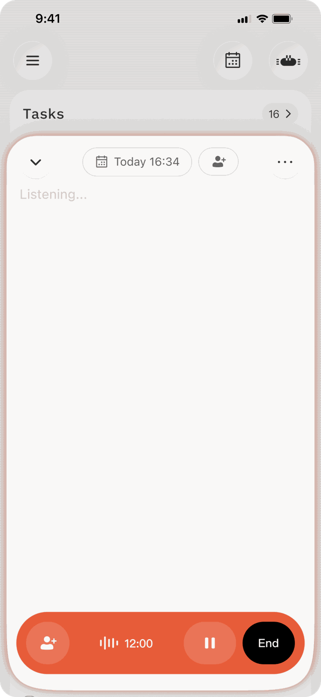
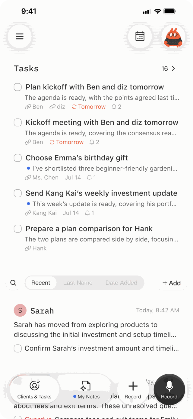
Inside the app the marks are quiet and the words do the work. Pixel Alter is the only place the character is the interface, and the morning queue is the hero surface.
Core screens · shipped
Onboarding · to make
Welcome
First screen. Peach ground, pixel Alter waving small at the bottom edge, one Agdasima line: KEEP TRACK OF YOUR CLIENTS. Two buttons, Sign up and Log in, ink and outline.
Connect your inbox
The trust screen, written as brand copy. What is read, what is never read, that it is revocable, and the DPA offered on the same screen. Marker Alter peeking at the corner with an envelope.
Your first client
Empty client list. Marker Alter with the folders prop, cropped by the bottom edge. One line: add one client, or say their name.
Record with the client’s okay
The consent line, said plainly: record it, with the client’s okay, or talk it through after. The record button below, orange, the only orange on screen.
Empty states and moments · to make
Nothing due today
The morning queue with nothing in it. Alter dozing, small, at the bottom edge. One line: nothing needs you today. Enjoy it.
Alter thinking
The chat while the agent works. Pixel Alter with the 80px thinking GIF in place of the avatar, three dots, nothing else.
Alter asks
The chat with Alter’s question and two answer chips: Draft the reminder · I’ll call him. The initiative trait, as a screen.
Something went wrong
Alter oops, small at the edge. The line says what happened and what to do next, no apology, no jargon.
Notifications · to make
Lock screen, morning
iPhone in hand at a kitchen counter, warm light. One notification: Check your morning brief · You have 5 follow-ups due today.
Lock screen, after a meeting
Phone on a car seat or a cafe table. One notification: Penny for your thoughts · You just finished 3 meetings. Any thoughts about them?
Lock screen, a question
One notification where Alter asks: Mr Tan’s review is next week. Draft the reminder? Two actions under it.
Marketing
Outside the app the hand comes forward: chalk lettering, marker Alter, real rooms. Interface floats into live action. Every asset passes one test: does it sell an assistant that follows through, or a feature?
App Store · shipped
Social covers · shipped
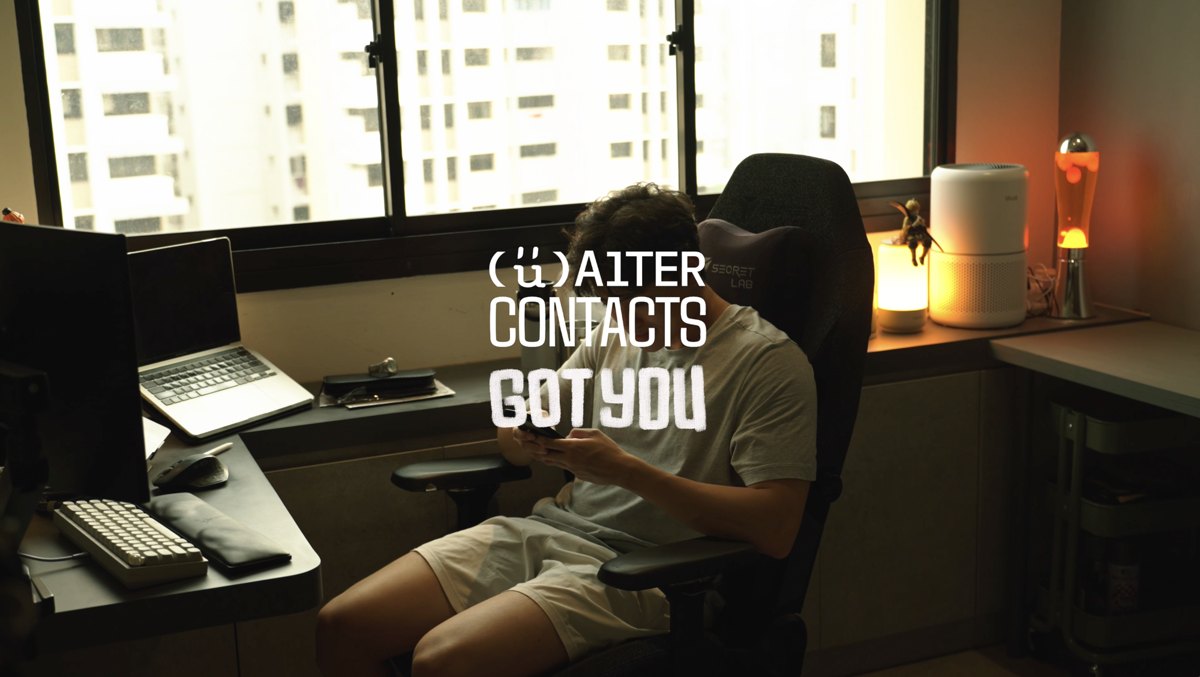
Launch videos · shipped
Video kit · shipped
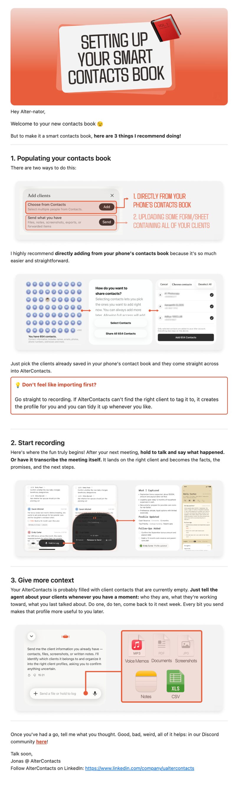
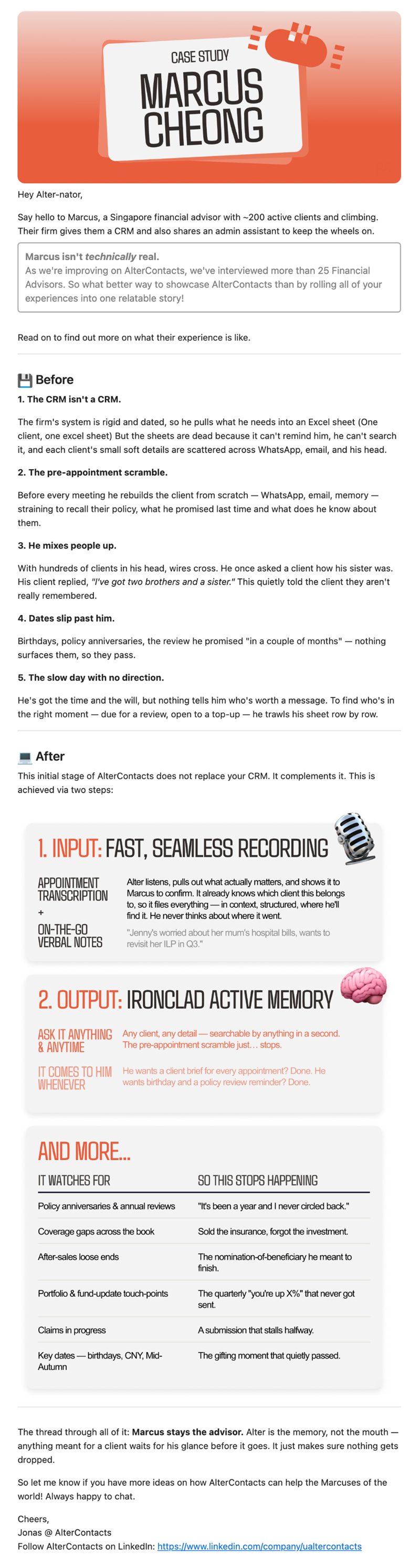
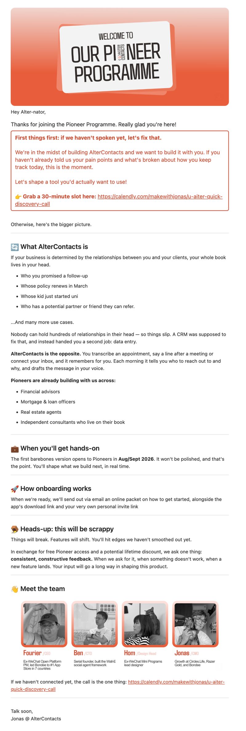
Email · shipped
Web · to make
Website hero
The contacts page above the fold: chalk-style headline in Agdasima over a real room, the tracking line, Request private access. Desktop.
Website on a phone
The same page at phone width, in hand, in a real room.
Instagram · to make
The grid
@ualtercontacts profile as it looks: the (ü) avatar, nine tiles showing the buckets side by side (meet the team, what we shipped, carousel, long-form).
A story with a sticker
One story frame: real room, chalk line, marker Alter as a sticker in a corner, the early-access link sticker.
Print and beyond · to make
Deck title slide
Peach ground, lockup centred, one Agdasima line. Alter at the bottom-right edge, small.
Stickers
Die-cut stickers: the (ü), pixel Alter, three marker poses. On a laptop lid, photographed.
Business card
White, the (ü) alone on the front; name in Plex Mono, role in SF on the back.
Tote or tee
One item, one mark. The (ü) large on cream, or marker Alter small on the pocket.